ARNEY RECRUITMENT
UX/UI | Front End Development
The Project
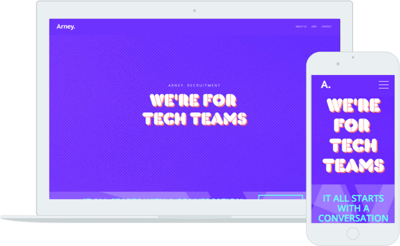
Arney Recruitment are a specialist IT recruitment consultancy based in Sydney and Adelaide. I was tasked with developing their website after a rebranding from designer Pass the Salt.
The Context
There are two major user groups that are being targeted for a recruitment consultant - the client and the candidate. The client is the company or individual who wishes to hire, and the candidate is the individual or team looking for a job. User research revealed that the website for a company like Arney Recruitment only serves a secondary resource for both the client and candidate. For the client, use of existing networks (internal and external), as well as job board services provides the primary mechanism to achieve the goal of finding the right hire. A very similar story is found for the candidate, where job boards and leveraging networks are used to successfully gain new employment.
The Workshop
Armed with the context, I conducted a workshop with Arney Recruitment to get a clear understanding of what the site purpose is. This was important to help develop content and flow that is fit for purpose.
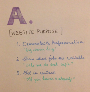
Arney website purpose statement from workshop
Each purpose also is tied to a user flow:
- Demonstrate professionalism: The user has just met one of the Arney consultants to discuss a job opening they have in their company. They quickly check the website to see what the company is all about, and whether it stacks up, after all, they’re a small niche player in a large market - can they be trusted?
- Show what jobs are available: A client has worked with Arney before, and trusts that Arney finds interesting work for them. They go to the website to see what other opportunities Arney might have that fits their needs.
- Get in contact: A candidate has been referred to Arney by a friend, so the user goes to the website to find out more information and to get in contact (this to an extent is an amalgamation of both 1 and 2).
The Prototypes
Using the philosophy of “Don’t Make Me Think”; the website purpose statement; and an initial template starting point (below left), I worked to hone the message for each user flow interaction with the site.
An initial concept (below centre) was drafted and then working with the visual designer, the elements were arranged to the final proposal (below right).
Key changes and elements to assist with usability were:
- Navigation redesign: The new navigation has a call to each purpose/user flow for the site. Removal of the content helps to hone the message and bring about the desired actions.
- Making calls to action more obvious: The initial design had an obvious call to action for making contact, but searching for jobs was hidden low down the page, and discovery content was extensive but somewhat overbearing. The redesign looked at enhancing scannability and leading to an action.
- Form redesign: The contact form was simplified and contact buttons made more prominent to assist with those using mobile devices.
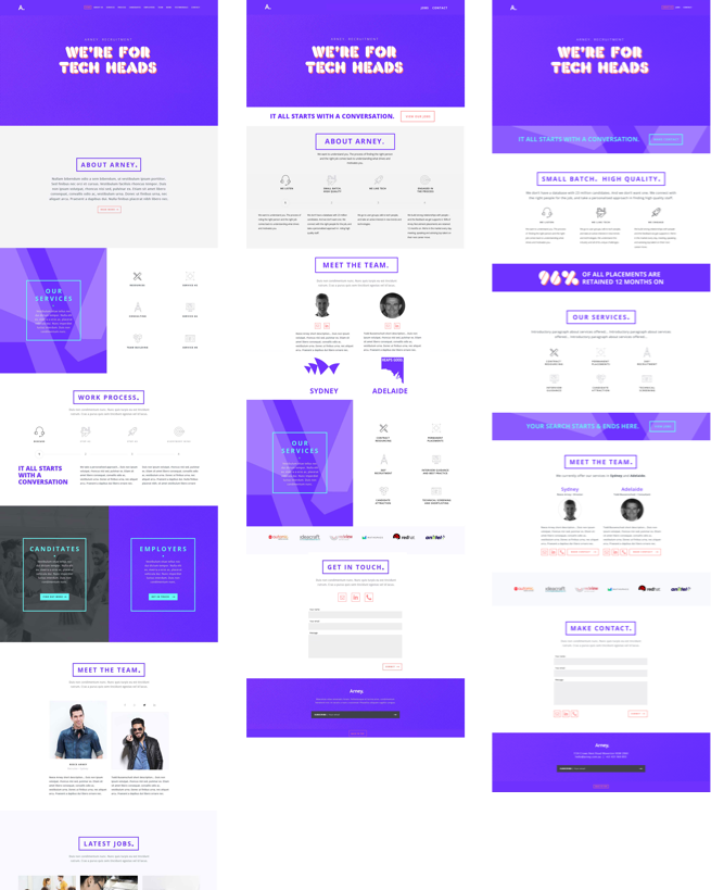
Arney website prototyping (left) initial template; (centre) initial concept; and (right) final design.
The Follow-up
Further user testing is slated for this project. The aim of the testing is to help test/validate the design decisions taken with regard to the three main user flows.